
Eolian
Eolian develops Augmented Reality (AR), Virtual Reality (VR), Mixed Reality (XR), AI/Machine Learning, & Data visualization solutions for enterprise, government & public sector entities.
Design Challenge
Achieve what few emerging technologies accomplish: DoD certification as deployment-ready. Create brand architecture and spatial user interfaces that would be deemed operationally relevant, mature enough for immediate fielding, and aligned with urgent mission needs. Design mixed reality workflows for mission planning, photogrammetry intelligence collection, location analysis, and briefings that function flawlessly under extreme operational conditions.
Branding
The definition of the adjective aeolian or eolian is “relating to or arising from the action of the wind.“Represented by the aggressive radiating circles, which also symbolize the immersive worlds built by the company.
Eolian Logo
Text
Eolian Logo
Symbol
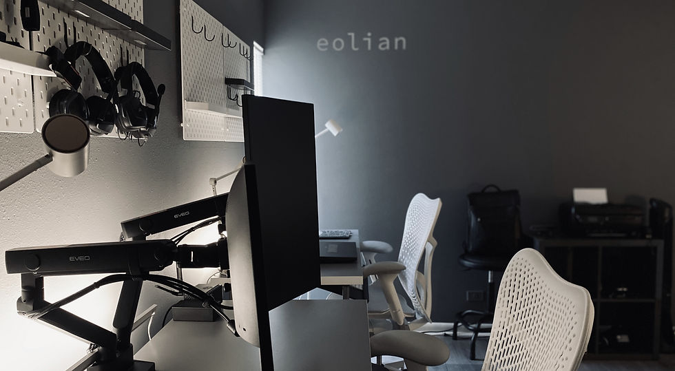

Eolian HQ | Tampa, FL
ESP
ESP is Eolian’s proprietary mixed reality solution the Eolian Simulation Platform & it sits at the foundation of an ecosystem of industry applications for enhanced productivity.
Eolian Simulation Platform, ESP Logo
Text

Eolian Simulation Platform, ESP Logo
Symbol

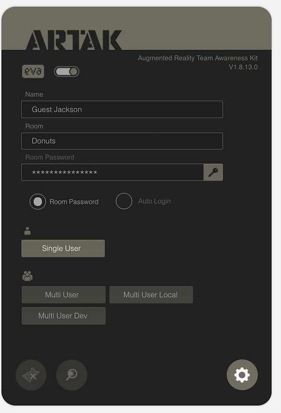
ARTAK
Augmented Reality Team Awareness Kit, provides enhanced situational awareness and 3D mission planning capabilities for operators at the tactical edge.

ARTAK Logo
Text

ARTAK Logo
Text Spatter version

ARTAK Logo
Text Spatter EliteTeams version

ARTAK Logo
Symbol


ARTAK | HoloLens Edition
Eolian's Brand Ecosystem
The ARTAK suite of applications that includes HUNT and MAPMAKER, & demonstrates the capacity of my design approach to visually scale parallel to company growth. ARTAK is device-agnostic, meaning that the applications are designed to take full advantage of the unique strengths of each device. As a result, the user interface (UI) adapts & adjusts based on the specific device being used.
Heads Up Node Tracker Logo
Symbol
Map Maker Logo
Symbol
Data Aggregation & Visualization for Intelligent Decisioning Logo
Symbol
Virtual Intelligent Robot Assistant Logo
Symbol
Augmented Reality Real Estate Logo
Symbol

HUNT UX / UI
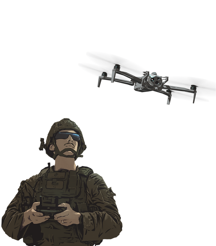
The Heads Up Node Tracker (HUNT) is an, on target HUD & mobile capability that supplements ARTAK simulations by exchanging essential realtime data to & from the user on the objective.


ARTAK | Technical Experiment 22-3 Demonstration
ARTAK UX / UI
ARTAK began as an ambitious idea: give tactical operators superhuman awareness through augmented reality. I transformed that concept first into a million-dollar OTA prototyping contract award, then into an APFIT-funded operational reality. This funding is awarded exclusively to solutions the Department of Defense believes are ready for real-world deployment in urgent mission contexts. As Creative Director, I led brand and UX/UI development from initial concept through prototype validation to fielded technology now transforming how elite teams operate.
Iconography


Spatial
UX/UI Development
With no existing Software Development Kits for mixed reality devices during ARTAK's prototyping phase, I pioneered Eolian's spatial design methodologies through rigorous hands on experimentation with the end user.
I designed finger scaled interface components that users could trigger manually in virtual 3D workspaces, establishing interaction paradigms that would become foundational to our spatial UI system.
ARTAK > Login
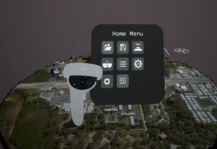
Menu
ARTAK > Login > Settings

ARTAK | VR Menu > Home | Oculus Quest Screenshot
ARTAK | AR Menu > Home | Magic Leap Screenshot

ARTAK | Desktop Menu > Home | PC Screenshot

ARTAK | Training w/ local and remote users


Impact:
In November 2022, Eolian became one of two software companies to receive APFIT (Accelerate the Procurement and Fielding of Innovative Technologies) funding from the US government, certifying deployment readiness and propelling the humble startup to established military contractor status with active defense partnerships. The fielded product is now serving DoD elite teams in actual operations: planning missions, gathering photogrammetry and geospatial intelligence, and conducting pre-and post-mission briefings through intuitive mixed reality interfaces. The design work met the DoD's stringent operational requirements, secured competitive APFIT funding that fundamentally changed Eolian's business trajectory, and achieved active deployment status. This validates how strategic design leadership can deliver not only mission-critical technology that performs when lives depend on it, but also the market credibility that transforms startups into trusted defense contractors.


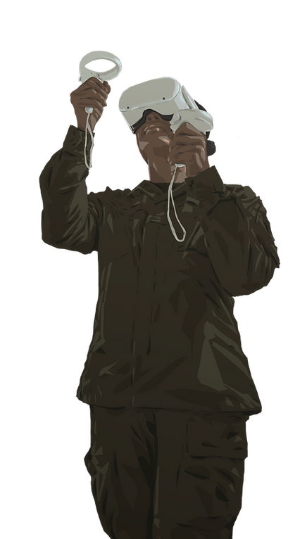
ARTAK Illustration


ARTAK Animation
The narrative driving the mission at Eolian is “Saving lives with innovative technology.” My role as the visual storyteller it is to make sure that urgency shines through each video, product and each piece of printed collateral.